Fairtree Global Flexible Income Plus Fund Q2 2025 Commentary


Market dynamics
Global risk
After the very slow start for US equities during the first quarter, and the superior performance emanating from the EU and the UK, the second quarter witnessed a turnaround in fortunes with the tech-heavy NASDAQ delivering its fourth-best quarterly performance number over the past 18 years. It delivered an eye-watering 17.97% as global investors came to the realisation that the impending collapse of the US economy due to the so-called “Tariff Wars” was not coming to fruition. The broadly based S&P 500 delivered 10.94%, whilst the Large Cap Dow Jones Industrial Average showed investors a still healthy 5.46% during the period. Moving across the pond, it was a much more sombre time for the FTSE 100, which rewarded risk takers with a sound 3.15% as the global bounce in risk was somewhat offset by market-unfriendly noises emanating from the current UK government. European equities sputtered, with French equities delivering sub 1% – a rather uninspiring number.
Table 1: Major Index Q2 2025 Total Return and historic rankings Q2 2007 – Q2 2025
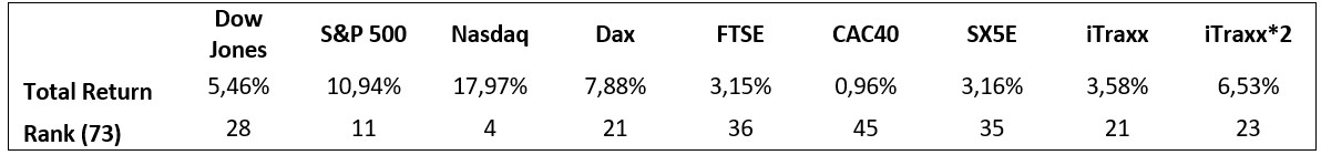
Source: Bloomberg, 30 June 2025
Moving to European credit, the iTraxx suite of indices produced another set of numbers that were quite meaningful. The iTraxx Crossover 5-year Total Return Index produced a rather splendid 3.58% which outperformed European equities on an outright basis. Our more favoured 2 times levered index, a more realistic measure of the relative performance of European credit, produced a healthy 6.53% for the quarter. We have consistently stated that in the absence of meaningful defaults, the iTraxx Crossover suite remains a good compromise of risk and available returns, and we feel that the index on a levered basis should offer a better risk-adjusted opportunity to investors who are willing to accept an excess premium to insure company credit. This aversion to catastrophic loss is probably the main driver of the very excess returns that the indices have produced since inception. One could suggest that the return to normality might undo this excess return, but our view is that the average investor has little to no appetite for taking such a risk. This play ensures that the risk premium remains elevated and is the very reason for the persistence of this excess return through time.
Given the fact that we have over 18 years of quarterly data, we can do more than just look at the outright performance numbers as well as the relative rankings. We can also have a look at relative risk measures such as standard deviations, Sharpe Ratios and other measures of risk-adjusted returns. This should be important to investors who do “feel” risk in the diffusion of the performance that they have been delivered. For the same absolute return in a portfolio, only a fool would be happy with more risk for that return than less risk. There are many definitions of what risk is, and what is important for one investor is quite different from another, but we feel that the most consistent and comparable is the time-tested standard deviation, which has its roots in its underlying mathematical construct. This makes it consistent in its treatment of any distribution of potential outcomes. The simple calculation of mean divided by standard deviation gives a good measure of risk-adjusted return and is one that we tend to like to look at. This is not the Sharpe Ratio (SR), as the SR strips out risk-free return as well as the volatility of that risk-free return, but we feel that the basic return per unit risk ratio is a good proxy for the slightly more rigorous SR. Obviously, a higher number is better as the investor receives more return for their accumulated risk. We must be aware, however, that a high number on its own cannot be viewed as the “Holy Grail’ since any low volatility index might deliver high levels of Return Coefficient but might not deliver that much by way of return. By way of an example, it might be foolish to buy an index that produces a 0.4% annual return with 0.2% annualised volatility – a return coefficient of 2, rather than an index that produces a 12% return with a standard deviation of 8%.
Table 2 shows the annualised returns, the annualised risk, as well as the return coefficients for the major indices that we monitor. These numbers are generated from our historic dataset and therefore do include risk periods such as the global financial crisis (GFC), the Greek government default crisis, the COVID-19 global pandemic, the more recent Ukraine/Russian war as well as the current war in the Middle East and all the political turmoil in Europe the UK and the United states. Perhaps it is more of the same rather than the exception at the moment, with the world (as usual) teetering on the brink of the potential for some financial fallout, but the traditionalist would suggest that this potential for fallout is the very reason that risk premia exist in the first place. No risk should have risk-free returns; those who choose to take the risk of loss should surely be rewarded for doing so. This line of argument would go a long way in explaining persistence in market returns. The “overvaluation” of US equities has been bandied around for the last two decades, and yet they continue to outperform their European counterparts. Contrary to popular opinion, the outperformance will more than likely continue until participants accept it as the “new normal”, and when that eventually happens, it will probably be followed by a reversal of fortunes. The relative outperformance of Europe over the first quarter of 2025 was indeed reversed during the second quarter of 2025. From a European perspective, Table 2 highlights the outperformance of credit from a risk-adjusted perspective. In fact, the more risk normalised two times levered index solidly outperforms its equity equivalent, offering investors excess return for a given risk target. If an investor is comfortable with equity-type risk, he/she should be more than happy with the extra return that iTraxx*2 has offered. This index goes a long way to close the relative gap to US equities.
Table 2: Index risk-adjusted return coefficient
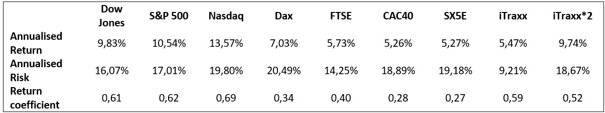
Source: Bloomberg, 30 June 2025
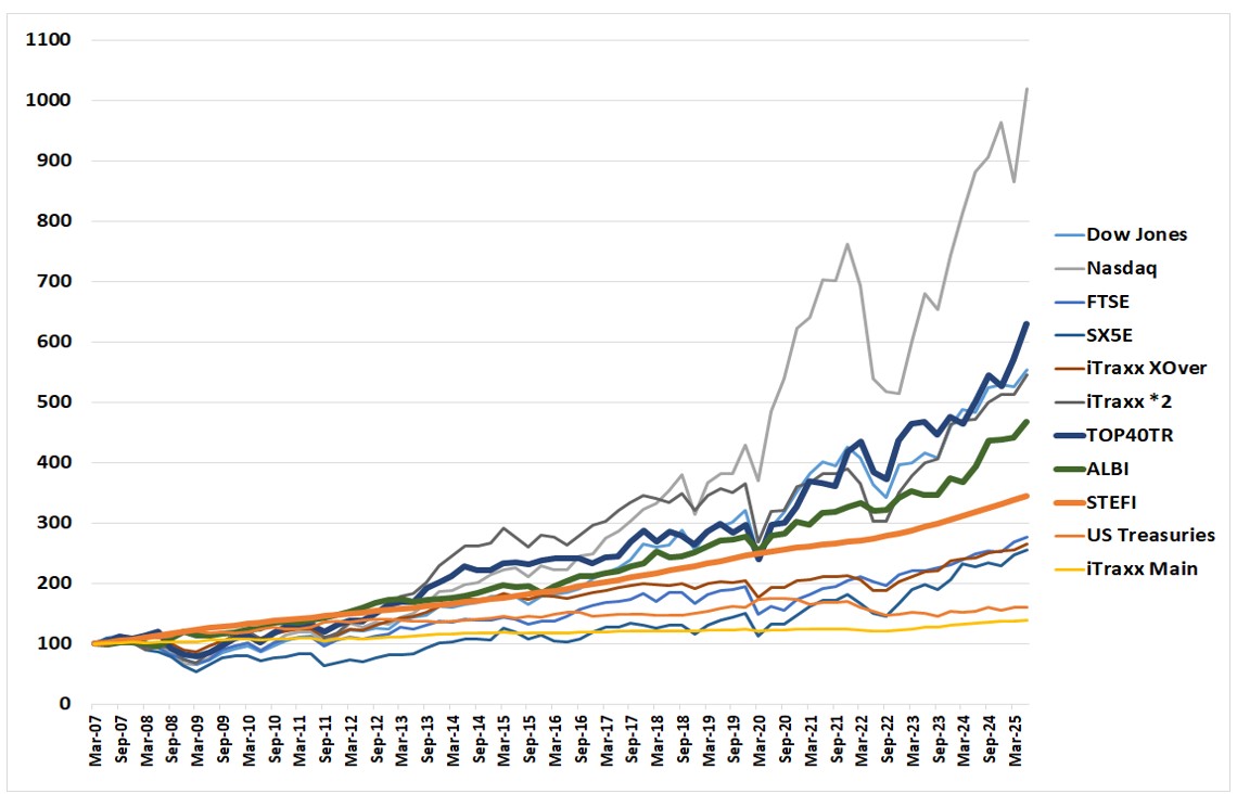
As an extension of the last quarter’s report, Figure 1 below shows the cumulative return of the various indices in the currency of the particular index domicile. The various performance traces have been indexed to 100 at the beginning of the second quarter of 2007, when we had the complete historical data for the iTraxx XOver and Main total returns.
When looking at Figure 1, it also becomes apparent that there are no returns to risk-free. The worst-performing traces over the 18 years are the iTraxx Main Index (125 equally weighted global investment grade credit names) and the US Treasuries total return index. Looking at the delivered risk, it becomes apparent that US Treasuries are not the least risky asset class but rather the well-diversified investment grade CDS index – iTraxx Main. They have generated the lowest returns coupled with the lowest associated risk over the past 18.25 years.
Figure 1: Major Index Total Return Q2 2007 – Q2 2025
Source: Bloomberg, 31 March 2025
As an extension of last quarter’s report, Figure 1 below shows the cumulative return of the various indices in the currency of the particular index domicile. The different performance traces were indexed to 100 at the beginning of the second quarter of 2007, when we had the complete historical data for the iTraxx XOver and the main total returns.
Figure 1 also shows that there are no returns to risk-free. The worst-performing traces over the past 18 years are the iTraxx Main Index (125 equally weighted global investment-grade credit names) and the US Treasuries total return index. Looking at the delivered risk, it becomes apparent that US Treasuries are not the least risky asset class but rather the well-diversified investment-grade CDS index—iTraxx Main. They have generated the lowest returns coupled with the lowest associated risk over the past 18 years.
Figure 1: Major Index Total Return Q2 2007 – Q1 2025
Source: Bloomberg, 30 June 2025
It is difficult to look at the returns and the associated volatility of those returns simultaneously in Figure 2. To disentangle the graphic and the more meaningful comparatives, we produce the delivered risk (as computed by the annualised standard deviation of quarterly returns) as well as the delivered annualised return over the 18 years. This is shown in Figure 2. If we were to fit a straight line to this dataset, we would observe an upward slope, indicating that there is a positive return to risk. Increase that risk, and it should result in a higher delivered return. The corollary of this is also apparent: a reduction in risk taken will result in a reduced overall delivered return. The textbooks, which have always stated that there needs to be an excess return to risk, are indeed correct. The short run is deemed to be random, whilst the longer run will yield excess return due to the extraction of the various risk premia. As time elapses, the risk premium (or positive slope) becomes more apparent. One heuristic would be that the short run is randomly distributed around a mean and variance, whereas the longer run is an equally weighted “portfolio” of those independent periods. Thanks to the only free lunch in finance, i.e., the Central Limit Theorem, the long-run results in a normally distributed outcome centred on the delivered risk premium. Mathematics delivers to investors that which economists can only posit.
Figure 2: Major Index Risk Return scatterplot Q2 2007 – Q2 2025
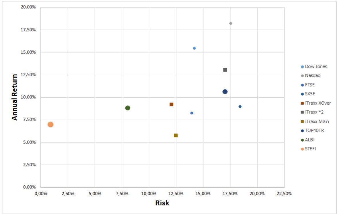
Source: Bloomberg, 30 June 2025
The domination in return terms of US equities, which was touched on earlier in this piece, is quite apparent in the figure, but one must be cognizant of the fact that these indices are shown in local currency.
Moving to the economic backdrop, Figure 3 shows inflation in the developed world (US, UK and Eurozone), highlighting the fact that inflation is well off its highs hit in the 4th quarter of 2022. The fact that the disinflationary trend, which started in the US, seems to have slowed down and even tacitly reversed a tad, has resulted in a more cautious response from the Federal Reserve. Although the Eurozone has hit its inflation target of 2%, resulting in interest rate relief from the European Central Bank, the question remains as to the stability of inflation going forward around that target. We would contend that inflation itself is a global rather than localised phenomenon, with the major driver of inflation being the overall pressure in global input prices rather than localised output prices. We therefore need to witness US inflation reducing further in order to see a continuation of the more recent gains in the reduction of European inflation. This does leave the ECB with fewer degrees of freedom going forward.
Figure 3: Annual change in Consumer Price Indices March 2010 – June 2025, US, UK and the Eurozone
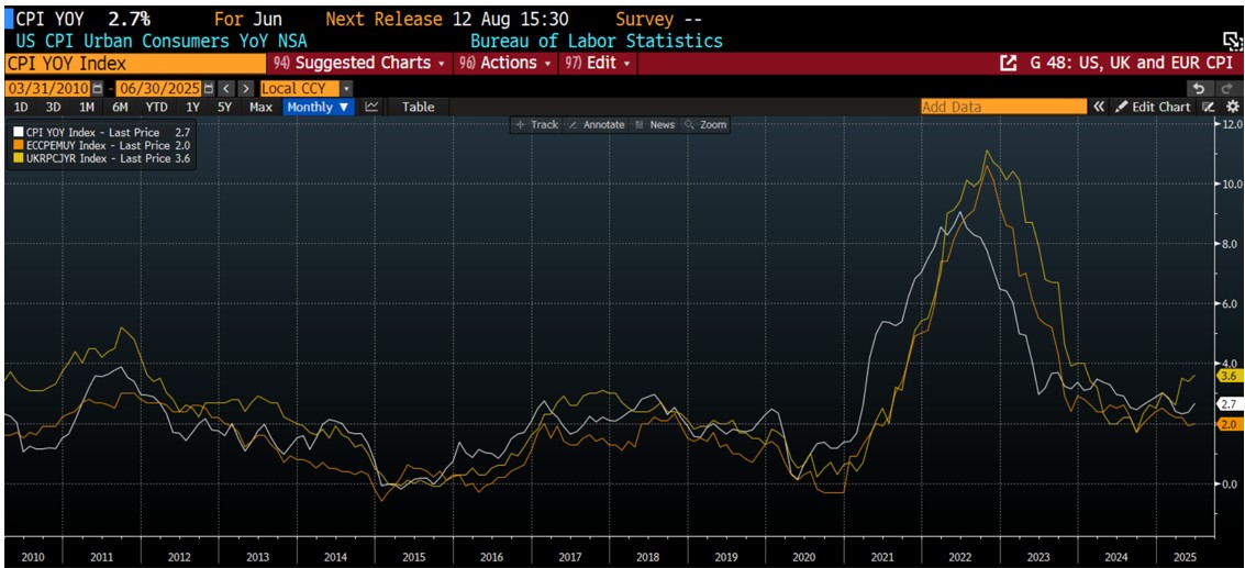
Source: Bloomberg, 30 June 2025
Figure 4 below shows the level of short rates as administered by the US Federal Reserve, the European Central Bank and the Bank of England. What is of interest to note is the high levels of correlation in both the direction as well as the extent of policy movement. The other point to highlight is that the response from the ECB has been the most aggressive in terms of timing and extent. The ECB was the first to start cutting and has cut the most since the beginning of the cycle at the end of May 2024. So far, the ECB has cut by some 235 bps, whilst the Fed has only cut by 100 bps, which is the same as the BOE. As was previously stated, the excessive end of Q1 pricing of US Federal Reserve action has been largely factored out of the market with Fed Funds Futures only pricing in some 50 bps of cuts by year-end, which has much more realistic optics than the 100-125 bps that were priced in at the end of April. Arguably, a lot has happened since then, but with US headline inflation stabilising in the high 2% context, it is difficult to justify aggressive action from the Fed so long as inflation is markedly higher than the unofficial target of 2%. Again, this highlights very little in the way of wiggle room for the ECB to continue its cutting cycle.
Figure 4: Central Bank Administered Rates
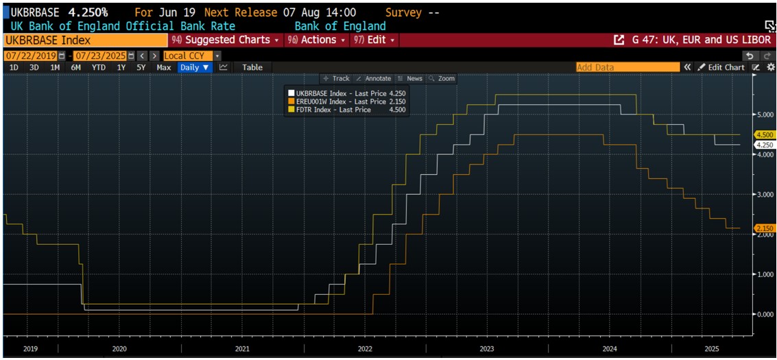
Source: Bloomberg, 31 March 2025
The movements in global bond yields are shown in Figure 5. The 10-year US Treasury, the UK Gilt and the 10-year benchmark European Bund are shown in the Figure, albeit using 32 different scales. It is interesting to point out the high levels of correlation between these three traces, and although short-term disconnects tend to take place, they generally are swiftly reversed. Bearing this in mind, one can see that the current yield on the generic 10-year bund is about correct. The other very interesting point to make is that the whole “Trashing of the UK GILT market” due to the appointment of Liz Truss on 6 September 2022, which finished some 49 days later, actually is unobservable in the figure. In other words, the mainstream media ascribed the Gilt selloff to the appointment of Truss rather than the Gilt selloff being triggered by a short-term global bond sell-off. Unless, of course, one believes that the US Treasuries and European Bunds were also affected by Truss’s cutting of government spending. To market participants, at least, this was not the case, and the cause/effect connection was inappropriately ascribed.
Figure 5: 10-year benchmark yields in the US, UK, and Eurozone
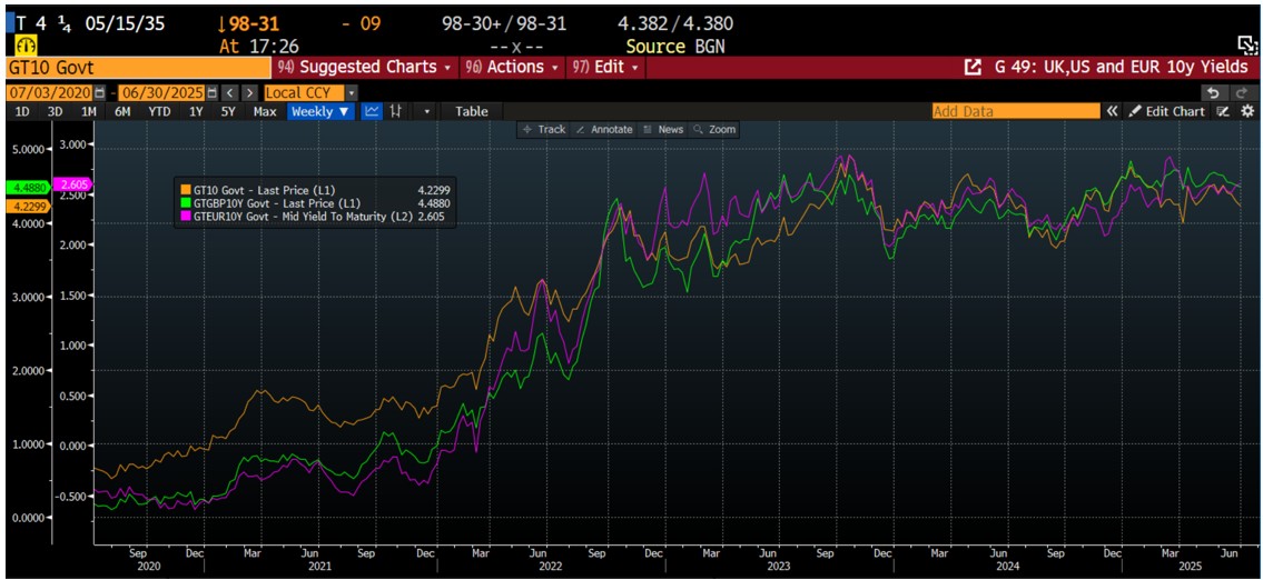
Source: Bloomberg, 30 June 2025
Fund performance
The strategy of the fund is to provide investors access to a well-diversified credit portfolio that aims to outperform its targeted benchmark, iTraxx Crossover Total Return Index, on an after-fees basis over the longer run. We have no control over the performance of the benchmark and assume that all investors are aware of the risk/reward prognosis of that index.
Table 3 shows the total performance of the Fairtree Global Flexible Income Plus Fund (Class A) relative to iTraxx XOver, iTraxx Main and the Barclays 3-month Euribor Index over various historic periods. It should be noted that the returns are net of full fees, and the full fees of Class A are 0.97% per annum. It is interesting to note that, although the short-term performance numbers are not that impressive relative to the benchmark, the longer-dated numbers still show marginal excess performance, even though the total fees are 0.97% per annum.
Table 3: Fairtree Global Flexible Income Plus Fund (Class A) historic annualised total returns to end Q2 2025
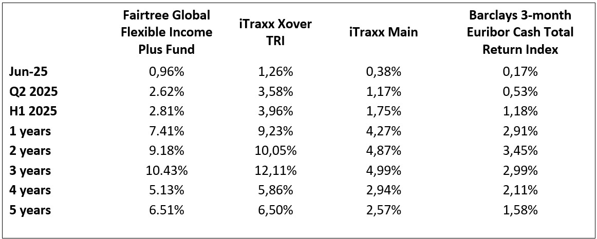
Source: Bloomberg, 30 June 2025
A few things become quite apparent, and even a touch startling, when analysing the table.
- The fund had a rather pleasing second quarter of 2025, generating 2.62% on an outright basis whilst outperforming cash by 2.09% on an after-all-fees basis.
- The fund has delivered in excess of 0.01% per annum above iTraxx XOver during the past five years and has delivered more than 4.9% excess return to cash over that period.
- The fund, despite its defensive positioning, has outperformed cash by around 4.50% on the most recent rolling one-year basis.
- The fund underperformed its benchmark by 0.96% during the second quarter due to running a low-risk bias.
Looking to the third quarter of 2025, the weakness that was witnessed in the previous quarter was seized upon and delivered excess performance during the second quarter. Credit spreads have narrowed again, however, delivering some healthy spread duration returns to the fund. This opportunity has closed, as the iTraxx 5-year Crossover spreads ended the quarter at 282 bps, or some 47 bps lower than where they ended the first quarter of the year. Currently, the fund spread sits at 365 bps, which is a little higher than where they were at the beginning of the quarter. After the two 25 bps rate cuts in April and June, EURIBOR has reduced to 1.94%, which indicates a total yield of around 5.60% on an NACQ basis. Subtracting the A Class TER of 0.97% from the yield gives us a pro-forma total return expectation of 1.15% for the third quarter. This obviously neglects capital gains or losses due to spread compression or expansion, as well as any movements in administered rates at the July and September meetings. We have pencilled in one more interest rate cut by the ECB relief at one of those meetings and feel that the risk case is for the ECB to have completed the cutting cycle. This outlook is dependent on the European inflation trajectory and its convergence to the official target of 2% as well as some more market-friendly international relations with the US.
In spite of this, we do believe that the global economic backdrop has improved somewhat, with global risk markets looking healthy at the time of writing. The quarter has got off to a good start with equities continuing the rally which started at the beginning of Q2.
Looking at the portfolio positioning, the fund has upped risk during the last quarter, and the fund is structured for a continuation of the credit bull run that started quite some time ago. We don’t see evidence of any impending risk-off sentiment, although we expect normal levels of volatility going forward. The fund remains fully defensively invested with ample liquidity to take advantage of any opportunities arising out of any market retracements that might present themselves during the next quarter.
The benchmark has rallied on a year-to-date basis, and although we feel that there is still further room for a continuation thereof, we do feel that at this stage of the cycle, a more defensive positioning is warranted. Our models do indicate that the fund is currently outyielding the benchmark on a pre-fees basis, but the excessive TER of the A-Class does make it quite hard for the managers to outperform the index on a post-fees basis. This probably needs some attention in the short run as the manager is quite loath to provide an investment vehicle that is not aligned to producing excess returns on an after-all-fees basis. The manager is not going to be sucked into excessive risk-taking to offset fee accretion at this point in the cycle.
Topics
Disclaimer
Fairtree Asset Management (Pty) Ltd is an authorised financial services provider (FSP 25917). Collective Investment Schemes in Securities (CIS) should be considered as medium-to-long-term investments.
The value may go up as well as down and past performance is not necessarily a guide to future performance. CISs are traded at the ruling price and can engage in scrip lending and borrowing. A schedule of fees, charges and maximum commissions is available on request from the Manager. A CIS may be closed to new investors in order for it to be managed more efficiently in accordance with its mandate. Performance has been calculated using net NAV to NAV numbers with income reinvested. The performance for each period shown reflects the return for investors who have been fully invested for that period. Individual investor performance may differ as a result of initial fees, the actual investment date, the date of reinvestments and dividend withholding tax. Full performance calculations are available from the manager on request. There is no guarantee in respect of capital or returns in a portfolio. Prescient Management Company (RF) (Pty) Ltd is registered and approved under the Collective Investment Schemes Control Act (No.45 of 2002). For any additional information such as fund prices, fees, brochures, minimum disclosure documents and application forms please go to www.fairtree.com
The Fairtree Global Flexible Income Plus Fund is registered and approved by the FSCA under section 65 of CISCA. Highest rolling one-year return 20.32% (Benchmark 17.74%) and lowest rolling one-year return -12.84% (Benchmark: -11.56%) information to 30 June 2025. The fund has returned an annualised return of 4.46% since inception (January 2019) (Benchmark: 4.79%). The fund’s annualised performance over 1-year is 7.41% (Benchmark: 9.23%). The fund’s annualised performance over 3 years is 10.43% (Benchmark: 12.11%). The fund’s annualised performance over 5 years is 6.51% (Benchmark: 6.50%). Fund returns disclosed are annualised returns net of investment management fees and performance fees. Annualised return is the weighted average compound growth rate over the period measured. Fund investment risk indicator level: moderate. Full performance calculations are available from the manager on request. Annualised performance: Annualised performance shows longer-term performance rescaled to a 1-year period. Annualised performance is the average return per year over the period. Actual annual figures are available to the investor on request. Highest & Lowest return: The highest and lowest returns for any 1 year over the period since inception have been shown. NAV: The net asset value represents the assets of a Fund less its liabilities. Inception date: January 2019.
This document is confidential and issued for the information of the addressee and clients of Fairtree Asset Management only. It is subject to copyright and may not be reproduced in whole or in part without the written permission of Fairtree Asset Management. The information, opinions and recommendations contained herein are and must be construed solely as statements of opinion and not statements of fact. No warranty expressed or implied, as to the accuracy, timeliness, completeness, fitness for any particular purpose of any such recommendation or information is given or made by the Manager in any form or manner whatsoever. Each recommendation or opinion must be weighed solely as one factor in any investment or other decision made by or on behalf of any user of the information contained herein, and such user must accordingly make its own study and evaluation of each strategy/security that it may consider purchasing, holding or selling and should appoint its own investment or financial or other advisers to assist the user in reaching any decision. The Manager will accept no responsibility of whatsoever nature in respect of the use of any statement, opinion, recommendation, or information contained in this document. This document is for information purposes only and does not constitute advice or a solicitation for funds.
Values-driven investing
Download the fund factsheet
Download the montly fund factsheet to view comprehensive information and performance data.


We are Fairtree
Subscribe to our newsletter
Stay informed with the latest insights and updates. Subscribe to our newsletter for expert analysis, market trends, and investment strategies delivered straight to your inbox.

"*" indicates required fields

FAIRTREE INSIGHTS
You may also be interested in
Explore more commentaries from our thought leaders, offering in-depth analysis, market trends and expert analysis.


Fairtree Balanced Prescient Fund Q2 2025 commentary
We anticipate continued macroeconomic uncertainty throughout 2025. Global investors remain cautious amid evolving geopolitical tensions and shifting trade policies.


Fairtree Global Equity Fund Q2 2025 Commentary
US equities ended the quarter 11.2% higher; however, they experienced pronounced volatility following President Donald Trump’s ‘Liberation Day’ announcements of tariffs on imported goods.

Fairtree BCI Income Plus Fund Q1 2025 Commentary
It was a complete turnaround in the fortunes of global equities in the first quarter of 2025. The 47th US President was sworn in during the period, and contrary to popular opinions, the US stock market took a bit of a beating from a relative perspective.
About you…
By proceeding, I confirm that:
- To the best of my knowledge, and after making all necessary inquiries, I am permitted under the laws of my country of residence to access this site and the information it contains; and
- I have read, understood, and agree to be bound by the Terms and Conditions of Use described below.
- Please beware of fraudulent Whatsapp groups pretending to be affiliated with Fairtree or Fairtree staff members.
If you do not meet these requirements, or are unsure whether you do, please click “Decline” and do not continue.